Michael Broderick
Drawn to it: an interview with artist Michael Broderick
Tue. March 17, 2015 by Gregg Shapiro


The emotion is the most difficult thing to depict.
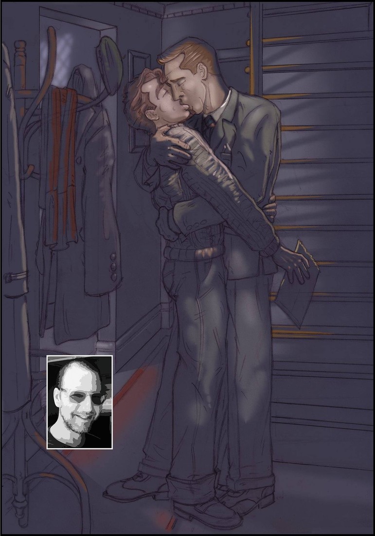
If you haven’t been to hottlead.com, the website of gay artist/illustrator Michael Broderick, you owe it to yourself to visit. Once there you can peruse some of his work and even purchase a piece or two if you are so moved. Broderick, whose artwork has appeared in numerous magazines, including Blue, (Advocate) Men, Freshmen, Flesh 4 Men, as well as the Bruno Gmunder titles Stripped and Stripped Uncensored, also provided the marvelous images in the new, visually stimulating gay graphic novel Fast Friends (Bruno Gmunder, 2015), a collaboration with Dale Lazarov. A native of a “dreary little burg in upstate New York,” Broderick has been drawing since childhood, seeking inspiration from cinematic heartthrobs; something you can see reflected in his work. I spoke with Broderick about the book in February 2015.
Gregg Shapiro: When did you first discover that you had a talent for drawing?
Michael Broderick: I’ve been drawing since I was a kid; literally since I could hold a crayon, but I didn’t realize I could draw erotica until college (in the early ‘90s). I saw the work of Tom of Finland and wondered, “Could I do that?"
GS: What artists and illustrators do you consider to be inspirations?
MB: Goodness (there are) so many! The ones that leap to mind are Tom of Finland, of course. But also J.C. Leyendecker (his work taught me a lot about making men handsome), Frank Frazetta, Alberto Vargas and Alphonse Mucha; all dead. If we look toward the living, Hajime Sorayama and the very much alive Robert W. Richards have been terrific inspirations. Their work is an instruction on so many levels; line, color, attitude. Amazing!
GS: How did you and Dale Lazarov become collaborators on the book Fast Friends?
MB: Dale saw my work somewhere and contacted me via Facebook. He thought my style would work very well in Fast Friends; it being a period piece, he thought my work’s vintage quality would suit the script.
GS: What can you tell me about how the process of collaborating with Dale Lazarov on Fast Friends worked?
MB: Working with Dale was a wonderful experience. He sent me the script. I did sketches for each page and sent them back to Dale. He sent me detailed feedback on each page. I’d make any adjustments, resubmit the page to Dale, and when we were both satisfied with the result, I colored the page. The color pages were then submitted to Dale and the process was repeated. When everything was the way we wanted, the finished book was submitted to the publisher. It was a very pleasant and productive way to work.
GS: Are you planning to work with Dale again in the future?
MB: Once I “recover” [laughs]. Doing a 64-page comic is very demanding even under the best circumstances. I’d love to work with Dale again. He’s great to work with!
GS: Are there other collaborators with whom you work, and if so, who are they?
MB: The only other person with whom I’ve done anything remotely similar is an author named J.D. Sanders, for whom I’ve done a series of book covers as well as illustrations for three erotic short stories. Some of the work I’ve done for him can be found at http://www.glenandtyler.com/.
GS: I admire the detail in your work, such as the body hair. Please say something about detail as an artist.
MB: Details, like body hair, or items on a night table, really help to set a scene and immerse the viewer in a period and/or place. They can make something idealized or otherwise unbelievable seem familiar and real.
GS: The luncheonette and the magazines depicted in the book have a retro feel.
MB: Dale’s contributions with those aspects were invaluable. He set Fast Friends in the late ‘50s/early ‘60s and new exactly how he wanted certain things (like the comics shop) to look for an urban center of that period. Many times Dale’s expert feedback would effect a change in a logo or shape of something to reinforce the period. The luncheonette was directly inspired by a place here in New York that has been operating since the ‘20s. I went there to get a good idea of what an old fashioned soda counter /diner would look like.
GS: The illustrations in Fast Friends are equally graphic and erotic. Can you say something about balancing those two things?
MB: Color and composition are key. Depicting out and out sex with no visual interest can be intellectually insulting to the reader/viewer. I think a scene, sexual or otherwise, needs to contain its own little story – no matter how seemingly insignificant – and balance is achieved.
GS: What is your favorite sexual position to draw?
MB: It’s funny, because I’m usually drawn most to the arch of an eyebrow or the curl/flex of a foot. The actual position inspiring those things is up to the imagination of the viewer/reader.
GS: Is there one that is more difficult to draw than others?
MB: Not really. The emotion is the most difficult thing to depict. The rest is line work.
GS: What did it mean to you to recently have your work included in the Stroke exhibit, co-sponsored by the Leslie Lohman Museum of Gay and Lesbian Art, at the Stonewall Gallery in Wilton Manors, Florida?
MB: It was a tremendous honor. It was amazing to have my work hanging alongside such luminaries as Tom of Finland and George Quaintance. Mind-blowing!
Interviewed by Gregg Shapiro. Gregg Shapiro is both a literary figure and a music and literary critic. As an entertainment journalist, his work appears on ChicagoPride.com and is syndicated nationally.